 |
||||
|
|
|
|||
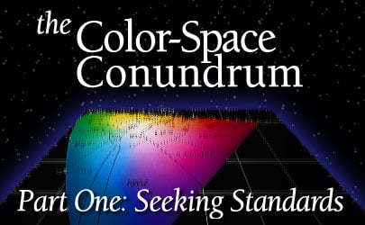
| In part one of a two-part series, AC, explores the historical relevance of color space and its impact on the cinematographer’s work. |
|
|||
Jump to: “The Color-Space Conundrum, Part 2”
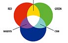
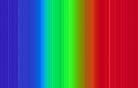
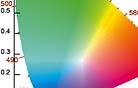
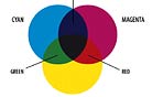
When John Schwartzman, ASC wanted to avoid the resolution-degrading optical blowup of Seabiscuit (2003), he took the Super 35mm footage into a digital-intermediate suite at Technicolor’s DI facility, Technique (now TDI), where the process was accomplished in a computer. Though the digital era is in its infancy, its tools offer cinematographers unprecedented control over their imagery. And new digital tools — file formats, projectors, Look-Up Tables, cameras, algorithms for color sampling, compression and conversion, etc. — are being developed at a breakneck pace. With manufacturers pursuing their own directions and goals, this has led to a digital realm without order, beyond the controlled borders of a select group of post facilities who have been engineering their own proprietary DI workflow solutions. Taking on the difficult role of sheriff in this lawless land is the ASC Technology Committee, which celebrates its two-year anniversary this month. Chaired by Curtis Clark, ASC, this august body consists of ASC cinematographers, associate members and industry professionals. “A primary objective of the Technology Committee’s work,” says Clark, “is to understand and define as clearly as possible what the tone-scale and color-space parameters are for each of the different platforms that we’re dealing with in a hybrid film/digital imaging environment. Cinematographers need a coherent, manageable workflow with toolsets that enable us to get the maximum efficiency and effectiveness out of the DI image processing so that it does not negatively impact the cinematographer’s creative intent, but rather enables us to take full advantage of its powerful attributes. We’re aiming for ‘best-practice recommendations’ that are not to be confused with the SMPTE standards, which pertain to engineering specs for technology components within the workflow. We’re not in competition with what SMPTE does because we are filling a much-needed function that was missing before our Technology Committee initiative. We are focusing on the workflow’s application functionality, procedures and usage and how they impact the practical work of cinematographers and directors.” During his color-timing sessions in the DI suite, Schwartzman encountered some of the variances that can plague the hybrid imaging environment. The suite had been calibrated for a regular Vision print stock filmout. Sometime during the process, the production switched to Vision Premier stock, resulting in a color shift on the new stock because of the now mismatched Look-Up Table (or LUT), which maps an input value to a location in a table, such as a pixel, and replaces that value with the table entry. Rather than start over and calibrate the suite and LUTs for Premier, through testing and familiarization, Schwartzman discovered that a certain magenta push in the digitally projected image would correspond to his intended perfect result on Premier film. In essence, he had experienced a collision of the digital and film color spaces. Color space, quite simply, is the geometric representation of colors in a three-dimensional space, such as with a cube, sphere or cone. They are tools to analyze and digitally encode color. There are many color spaces, including HSV, CIE XYZ, HSL, sRGB, CMY, CIE L*u*v*, CIE L*a*b* and CMYK. Volumes have been written about color, color space and color science and their applications to imaging. While I do not have an infinite number of pages in which to discuss this topic, I will broadly discuss color, how we perceive color and how color has been handled in the motion-picture and television industries. For a good starting point, just look at the sun — and I don’t mean that literally. This G2-class, main-sequence star at the center of our solar system heaves electromagnetic energy into space in the form of waves of varying lengths, or frequencies. These waves bombard Earth. The atmosphere reflects or absorbs most of this energy, but some waves make it through to strike the planet surface and its countless sunbathers. This is known as light, and it is good, for we need it to see. However, humans are able to visually perceive a very narrow frequency band of this radiant energy. The ancient Greeks postulated that the four elements of earth, wind, water and fire correlated with a four-color theory, though their philosophical writings never directly tied an element to a specific color. Other hack theories were that a color was based on the smoothness of the atoms that constituted it, or that color consisted of quantities of energy where white was pure energy and black had none. While investigating color mixtures, Aristotle offered philosophical waxings that were also well off the track, but his approach at least began to steer the concepts in a better direction. As the story goes, one afternoon Aristotle spied some daylight hitting a white marble wall, and he held up a yellow glass fragment. The daylight that passed through the glass and struck the wall turned yellow. He then held a blue glass fragment between the yellow glass and the wall. The resulting light on the wall surface was blue, yellow and green. He therefore surmised that blue and yellow create green when mixed together, which isn’t quite true when it comes to light. Rather than mix to form green, the dyes in the glass subtracted portions of the light until all that was left to pass through in a certain spot was green. Well over 1,500 years passed before Sir Isaac Newton ate the apple he saw fall from the tree — the one that led him to formulate the Universal Law of Gravitation — and turned his attention to the light that allowed him to see said fruit. He placed a prism in front of a pencil-thin beam of sunlight, which, because of a prism’s variable refractance properties, caused that white light to disperse into its component frequencies: red, orange, yellow, green, blue, indigo and violet, in ascending order from lower to higher in wavelength. Wavelengths of visible light range from 380 nanometers to 760 nanometers, and the length of a wave affects its color. A shorter wavelength, such as that of violet, has a higher frequency — that is, it cycles faster with less distance between peaks in the wave. Newton didn’t get this far in his thinking, however — he passed the component light through an upside-down prism, which reconstituted the frequencies into white light (see diagram). Rainbows aside, all radiant energy is “colored.” The colors that we can see fall within the visual spectrum, and this spectrum makes up what we commonly refer to as light (see diagram). An example of a higher frequency that radiates just outside the bounds of the visual spectrum is ultraviolet. Although often referred to as ultraviolet light, that phrase is a misnomer — it is actually what we call ultraviolet radiation. If you can’t see it, it can’t be light. Bees can, so UV is light to them. Can you describe the color of ultraviolet, a color you cannot see? (And don’t say purplish, based on the groovy black light you once had in your dorm room. That novelty’s high-UV-output fluorescent tube allows some visible violet light to pass through so you would know that it is on.) UV-A energy also is emitted but can’t be seen. Only the effect this frequency of energy has on certain substances can be seen, causing them to fluoresce. (Rest assured, the tube doesn’t allow the shorter wavelength UV-B and UV-C frequencies to pass through and cause skin cancer.) |
|
|||
|
<< previous || next >> |
||||
|
|
|
|
|
|

|
|
|
|
|
|
 |
|
|
|
 |
|
|
|
||
|
|
 |
|
|
|
||
|
|
 |
|
|
|
||
|
|
 |
|
|
|
||
|
|
 |
|
|
|
||
|
|
 |
|
|
|
||
|
|
 |
|
|
|
||
|
|
 |
|
|
|
||
|
|
 |
|
|
|
||
|
|
 |
|
|
|
||
|
|
 |
|
|
|
||
|
|
 |
|
|
|
||
|
|
 |
|
|
|
||
|
Additional images start on page 4 |
||
|
|
||