 |
||||
|
|
|
|||
Enhancing Wonka’s World
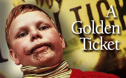
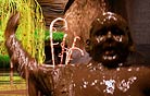
Building on his experiences with the Lord of the Rings trilogy and Harry Potter and the Prisoner of Azkaban, colorist Peter Doyle designed a custom color-grading facility for Charlie and the Chocolate Factory, along with a network pipeline to shuttle select 2K images to multiple sources in England and the United States. In the last few weeks of the shoot, Doyle set up a grading station at Pinewood Studios so that he and lead colorist Mel Kangleon could begin refining the look of Charlie with director of photography Philippe Rousselot, ASC, AFC and director Tim Burton. The original 35mm negative was scanned into the digital realm on a Northlight scanner at Cinesite in London, and after the grading was completed, Cinesite recorded the digital files out to 35mm with an Arrilaser Film Recorder. “In the grading, we really needed to work with Philippe on each scene,” recalls Doyle. “Often, we took whatever lighting cues he had put in and just amplified them. Philippe and Tim are both extremely collaborative and very open, so we also came up with some of our own ideas to open up the discussion.” Throughout the grading, the team viewed images on a 26'-wide screen, which was also used to project film and hi-def preview cuts. “Our goal was to emulate the theatrical experience,” notes Doyle. “That way, everyone knew exactly what the film would look like. “Charlie was a complicated film to grade,” he continues. “I’ve never seen anything quite like it.” The grading involved a variety of techniques to enhance the lighting by “putting more dynamics into wide shots, heightening shafts and pools of light, burning and contrasting here and there, letting the highlights really bloom, and pushing the center of the light down so that the grass had a real glow.” For group shots in the Chocolate Room, the colorists inserted “inverse grads” to darken the bottom of frame, also adding a little green reflection from the grass below. In general, says Doyle, “we put in more shading and modeling.” Time was also spent keeping the color of the Chocolate River consistent in different camera angles. To heighten lead actor Johnny Depp’s expressive eyes, the filmmakers borrowed a technique from George Hurrell’s classic Hollywood portraiture. “Johnny’s face is extraordinary, and we sought to make him look incredibly glamorous, to give the image that quality of Forties photography where the guy was shot through silk stockings and punched little holes in them to make the eyes really sharp,” says Doyle. “We used those kind of tricks, but digitally, with moving color images. In group shots, there are a lot of great performances with eyes, so we tried to give [those actors] a glamorous look while keeping the sharpness and the detail.” Wonka’s skin coloring is distinguished from that of the other characters by a “slightly unearthly quality,” says Doyle. “The idea was to subtly separate Wonka from his environment by tweaking his flesh tone.” This was accomplished “mainly by desaturating slightly and keeping the color in his eyes” and tinting Depp’s face “a very, very light blue — it’s not that he has a blue face, it’s just not pure white.” The bulk of Charlie is characterized by amazingly vibrant colors. According to Doyle, the filmmakers’ goal was to “see how much color we could get on a film print. And that’s where we are: we have about as much color as a film print can handle. To be precise, we boosted the color to the limit of the film print and then pulled back all the little colors that exploded and became unwatchable. We re-tracked the densities of certain colors so that the image made sense again. I must say, I’m incredibly happy with the result, but it does dazzle. We have some colors you don’t normally see on film prints because they tend to fall away, like deep burgundy.” Throughout the process, the colorists strove to keep the images “very sharp and clean,” says Doyle. Rousselot shot Charlie in Super 1.85, a format that covers more negative by imprinting the area normally reserved for the sound track. On the final film recording, the image was reduced to fit in standard 1.85:1, which “sharpened it a bit,” notes Doyle. Building on the existing high-security Sohonet that links postproduction houses in the London area, Doyle and his team implemented a pipeline that shared 2K scans and effects shots among a central storage in London, the production at Pinewood, Cinesite, visual-effects houses in London, and Warner Bros. in Los Angeles 24 hours a day, seven days a week. “Each facility can schedule itself; they can send data when they’re ready, and we can take data when we’re ready, though it does get a little tricky at delivery time,” explains Doyle. Doyle’s team created custom look-up tables (LUTs) to transfer the 2K data to HD. This allowed for the creation of HD preview cuts as the picture evolved. “Obviously, HD is not absolutely identical to film — a film print looks better — but the general feel is definitely there,” says Doyle. Even at 100 megabits per second, the network could only deliver about 1 frame of 2K footage per second. Thus, the network could only ferry short sequences for grading, effects and previewing. Copies of the entire film were more efficiently delivered in disk or tape form by “sneaker net”: fast-moving humans. |
|
|||
|
<< previous || next >> |
||||
|
|
|
|
|
|

|
|
|
|
|
|
 |
|
|
|
 |
|
|
|
||
|
|
 |
|
|
|
||