 |
||||
|
|
|
|||
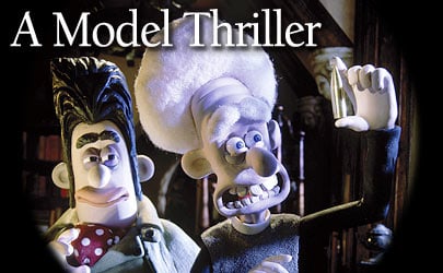
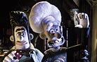
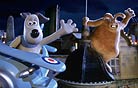
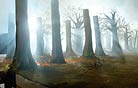
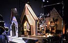
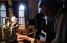
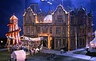
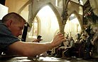
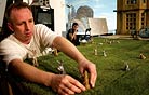
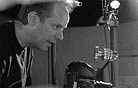
A Textured WorldA Grand Day Out introduced Park’s dynamic duo to the world, but it was The Wrong Trousers, their second adventure, that fully established “the Wallace & Gromit look.” Whereas Park had designed, shot and animated A Grand Day Out on his own because it was his student thesis project, he was able to tap Aardman’s rich pool of talent to bring the subsequent films to life. Yet Riddett recalls that even on The Wrong Trousers, he and Park had few discussions about the look the director had in mind. “We never have sat down and talked about it,” says Riddett. “I suppose it’s really about the feel of things. The look comes from the script, the character design and the sets — there’s a certain hominess to it, a slight softness toward the edges. Of course, the composition element comes from the storyboards, and Nick tends to be very specific about framing because he used to draw his own storyboards. But the lighting tends to go without saying.” “An obvious factor in the look is that our characters are Plasticine, and there are only so many ways to light a piece of Plasticine before it starts to lose its texture,” adds Oliver. “The difference between exposed and overexposed, especially with Wallace & Gromit, is very small. I also think the art direction is incredibly important, and in addition to continuity with Dave and myself, these films have had continuity in the art department with [production designer] Phil Lewis. Everything he has designed for these movies lends itself to that look.” Lewis, who spent 15 years designing models and effects for commercials before he joined Aardman, collaborated with Park on a handful of spots before coming aboard The Wrong Trousers as the assistant art director. “Nick had done all the work on A Grand Day Out himself, including making a lot of the props, and it had a handmade quality he was keen to keep,” says Lewis. “The Wallace & Gromit look therefore has much to do with the use of texture — everything’s got a characteristic texture — and color. He also wanted to keep a ’50s feel; that not only seemed to suit the characters, but also offered, I think, elements of his own childhood. He describes these films as ‘comedy thrillers,’ or, in the case of Were-Rabbit, ‘comedy horror.’ A lot of that comedy comes from a slightly cartoony quality, and the thriller or horror [aspect] comes from British filmmaking of the ’50s. Nick and I are around the same age, and those films were often what we saw on television when we were kids.” Although Were-Rabbit’s cinematographers used a full range of prime lenses, 14mm to 300mm, Lewis and his team used a 24mm lens during the design phase to assess cardboard mockups of sets, or built virtual sets in the computer with that perspective in mind. “The lens used when the set actually hits the studio floor isn’t necessarily the one we take into account,” says Lewis, “but when we’re looking at any set, we tend to make sure we’re covered on a 24mm. That often suits the world of our puppets quite well. “Absolutely everything is designed and drawn, including every prop,” Lewis continues. “Nick is very particular about the design of anything that’s got a gag, or anything that the puppets come into contact with or are very close to, and those items will often be very carefully briefed out and tested, but the farther away from the puppets we go, the more [the design] ends up as an art-department issue. We work shot by shot; we determine the views we want and then create them, sometimes at a number of different sizes and scales, and often multiple times.” Building multiples of the same set facilitates the simultaneous filming of different angles of a scene when time-intensive stop-motion animation is involved. “Even if we’re shooting two characters in a living room,” says Oliver, “we’ll have one set that works one way and one that works the other way so we can shoot the reverses at the same time.” Gothic HorrorThe Hammer horror films made in the ’50s were especially influential on the design of Were-Rabbit. “It was no film in particular,” recalls Lewis. “It was more a case of capturing the overall qualities and either slightly exaggerating them or carefully suggesting them, depending on whether the shot was a drama shot or a comedy shot. We referenced the films mainly for their mistiness — the smoke-machine quality of the fog.” In fact, how to create the fog that pervades Were-Rabbit’s night exteriors was the first task at hand when Oliver joined Riddett for preproduction testing, in April 2003. (The shoot commenced six months later.) Maintaining visual continuity in misty scenes bedevils cinematographers of every stripe, and working frame by frame at model scale only magnifies the challenge. In collaboration with visual-effects artists at MPC, the filmmakers arrived at an approach that combined animation plates shot on a clean set, fog plates shot at live-action speed, and a handful of digital enhancements. (See sidebar on page 36.) Another horror-movie staple in Were-Rabbit is the fluid tracking shots that suggest the monster’s POV. These motion-control shots typically begin at ground level and then climb to a towering height as the were-rabbit transforms. With these shots in mind, Barnes added three snorkel-lens systems and two inclining prisms to Aardman’s collection of macro-focusing Canon prime lenses. (For Were-Rabbit, he also acquired 100mm, 135mm, 200mm and 300mm Canon stills lenses and had them rebuilt for close focusing.) “Because our human characters are so tiny, 6 or 7 inches tall, we needed to use some optical devices to achieve POV shots that were lower than they were,” says Barnes. “Quite a lot of the were-rabbit POV shots were achieved with a lens on a snorkel system hung from a Milo [motion-control crane].” One such shot plays out at night in a medieval church, where Rev. Hedges becomes the first to glimpse the were-rabbit. Lured into the church by a candlelit vegetable display on the altar, the creature eyes the vicar from behind a pew, then rushes up the aisle to snatch the vegetables before making its escape. “Willy Marshall, my motion-control operator, created a lovely organic move on the Milo that was initially furtive and hesitant and became a swooping push up the aisle toward the terrified vicar,” says Oliver, who shot the sequence under Box’s direction. “We used a snorkel because the floor was in shot all the way through, and that was the only way to get the camera into the set. I would have preferred a prism because it creates a lower camera angle with little rigging fuss or light-loss calculations, but the spacing between the church pews was little more than the width of the lens, and a prism is fairly wide. The snorkel was very old and ropey, and we were working at the limits of its close-focus abilities. We also had to avoid camera shadows and allow adequate access for the animator.” |
|
|||
|
<< previous || next >> |
||||
|
|
|
|
|
|

|
|
|
|
|
|
 |
|
|
|
 |
|
|
|
||
|
|
 |
|
|
|
||
|
|
 |
|
|
|
||
|
|
 |
|
|
|
||
|
|
 |
|
|
|
||
|
|
 |
|
|
|
||
|
|
 |
|
|
|
||
|
|
 |
|
|
|
||
|
|
 |
|
|
|
||
|
|
 |
|
|
|
||
|
|
 |
|
|
|
||
|
|
 |
|
|
|
||
|
|
 |
|
|
|
||
|
|
 |
|
|
|
||
|
|
 |
|
|
|
||